Table of Contents
If you’ve ever tried your hand at designing an office (or a home space) without the help of an interior designer or an architect, you know just how many variables can go wrong.
When designing any space, there are many tangibles and intangibles one needs to consider. The reason why so many homegrown design projects fail is because most of us end up looking at the object of focus, rather than the whole picture. That is to say, we’re not seeing the space around us from an architect’s perspective.
‘They have so many years of education and experience’, you say. And we hear you. We’re not here to replicate their studies or experience, we’re just here to tell you about the best architectural tips and tricks that will help improve the space around you.
Placement and zoning matter
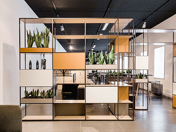
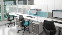
When designing an office, there are many variables to think of. However, the highest order of precedence goes to placement and zoning. This is because if you nail this variable perfectly, then it highly assists in boosting productivity.
Let’s think of a few ways to use placement and zoning to create an optimised workspace: 1. It would be best if the project team and the engineering team are placed side by side so that all decisions and important discussions are undertaken in a timely manner. 2. In a similar way, if you have a creative team onboard, then it would be beneficial to have the project team and the creative team work next to each other too to discuss project details as it goes along.
Think of the whole picture (and all the stakeholders included in the said picture). From an architect’s perspective, you need to design a space that is not only pretty to look at but also helps with efficiency and creates a balance.
One way to achieve an (almost) perfect placement is to have a well-versed understanding of the size of space you’re dealing with. Another way to achieve it is to determine if your plan is form-based (which means that design is your main priority) or goal-based (which means that you’re working with a goal in mind, like promoting efficiency or creating an open office atmosphere, etc.)
Here’s an additional resource that highlights how a few companies helped boost engagement amongst employees by strategically using seating arrangements:
https://robinpowered.com/blog/six-companies-activity-based-working-environment
Think of the visual hierarchy
Your brain forms opinions of a place at the very first look. So, you can do a lot to affect the first opinion a person’s brain can have by the way you design your office.
One way we’d suggest to help shape the opinion is to think of a visual hierarchy when designing your office. By using visual hierarchy, you place design elements by the order of importance. For example, you can use certain colours, contrasts, textures, etc to pull in the attention of the viewer.
Playing with perspectives and leveraging object shapes and sizes, are other sure shot ways to achieve this. To attain perfection over visual hierarchy, a thorough understanding of viewing patterns will help (F pattern, Z pattern, etc).
Read more about visual hierarchy here.
Lighting is everything
Lights don’t get credited enough. They’re literally the building blocks of setting an atmosphere at a place. These lights (be it artificial or real) can help you highlight, unhighlight, set the tone, or bring attention to whatever you want.
However, just don’t think of interior lights here; exterior lights have a huge part to play too. They should be set in such a way that they should welcome the customer in.
How can lights help in emoting feelings you ask? Although not much is known about how much light can affect us (human emotions can never be quantified), we can tell you that lightning psychology plays a huge part in our everyday lives.
In fact, to understand the implications of lightning on psychology better, you should take a look at ‘Light: The Shape of Space’ by Lou Michel and ‘Architectural Lighting Design’ by Gary Steffy.
Put comfort over everything (No metaphors implied)
Now that all design aspects are discussed, let’s focus on comfort. Rather, even before thinking of design, keep your focus on comfort first. This is because the design is momentary, but comfort is forever.
No, really, you have to focus on the practical aspect of actually getting the work done in the office with the layout and furnishing you’re creating. It doesn’t matter if you can create a place as pretty as the Vatican museum — if it doesn’t achieve the purpose it was made for, you’d be left with the guilt of a failed design. So, always focus on comfort before every variable.
When we speak of comfort, we mean comfort as a whole, including office layout, comfortable furniture, (maybe even workplace temperature). Read more about the types of office layouts you can consider to create a comfortable working environment.
Don’t overdo it
Last, but not least, you don’t want to overdo it. Always keep the look decent, if not minimalistic. It’s often harder to tone down things once the design is made than to tone it up. Unfortunately, if you do end up with an over-do, your space might end up looking like clutter.
We don’t want that. We want to keep things pretty, simple, and clean. A place where design and comfort can move synchronously. It’s often easy to get excited at the prospect of the possibility of what a design could be, but always make purchase decisions with a plan in sight.
You’ll find that you’ll often falter with your purchase decisions if you walk inside a store without a plan.
Parting words
And that rounds up our best tips and tricks! If you think we missed out on something, feel free to get in touch with us to let us know. Aside from that, if you’re looking for a place that will help you get the right quality furniture at the right price (to top it off, offer a free consultation on how to arrange the furniture to create an appealing environment around you), then we’re right around the corner.


