Table of Contents
The Apprentice boardroom has long stood as a symbol of business success.
With Lord Sugar and his accolades taking centre stage and a vast square meeting table ideal for comfortably fitting all candidates, it’s the perfect space for collaboration and creativity to be sparked—or is it?
The experts at Auraa Design have evaluated the infamous boardroom set-up of this popular TV spectacle and have determined that it was designed with more nefarious intentions in mind, crafted to incite drama, intimidation, and confrontation between the contestants and the esteemed members of the board.
From the not-so-friendly exchange that led to Katie Hopkins’ iconic resignation ahead of the 2007 finale to Debra Barr’s attitude that saw her clash with both fellow contestant Ben Clarke and Lord Sugar’s trusted advisor Nick Hewer, there’s been no shortage of showdowns witnessed in The Apprentice boardroom.
And that’s not to mention the series-first shock of the most recent season, which saw Lord Sugar haul the losing team back to the boardroom for a never-before-seen double-firing following their failure in the Jersey Islands where the contestants must negotiate and secure nine items synonymous with the local area. Sugar dubbed this his “favourite task” and expressed his deep disappointment in a blowout, which caused him to state that he “had never seen a mess like it in all these years.”
But how exactly does this layout cause so much tension?
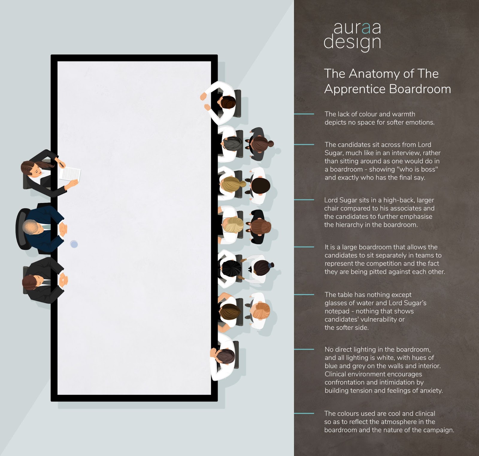
The set-up of The Apprentice boardroom
Our design experts explain, “Offices and boardrooms can certainly be designed to incite specific emotions purposely.”
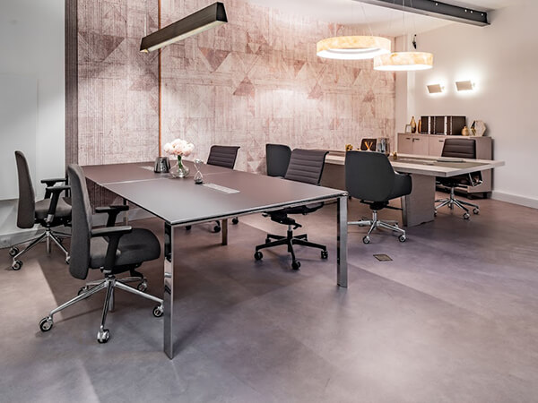
According to them, the boardroom has been flawlessly designed to be sterile and minimalistic. It is ideal for inciting competition, confrontation, intimidation, and anger—the perfect ingredients for TV entertainment. Producers have taken full advantage of these tactics to incite explosive boardroom showdowns.
Our experts explained, “The lack of colour and warmth depicts no space for softer emotions. It’s cut-throat.”
“The set-up of the room has been very well thought through. The candidates sit across from Lord Sugar and his close business associates, much like in an interview, rather than sitting around as one would do in a boardroom – showing “who is boss” and exactly who has the final say.”
“Lord Sugar sits in a high-back, larger chair compared to his associates and the candidates to further emphasise the hierarchy in the boardroom.”
“It is a large boardroom that allows the candidates to sit separately in teams to represent the competition and the fact they are being pitted against each other.”
“The table has nothing except glasses of water and Lord Sugar’s notepad—nothing that shows candidates’ vulnerability or the softer side. All they (candidates) bring to the table is themselves and their intelligence and cunning.”
The lighting in The Apprentice boardroom
Lighting has long been used in film and television production to convey and incite specific emotions. Think of the red hues cast in the dining room of the Saltburn mansion during the confrontation between Farleigh and the rest of the family immediately following Felix’s untimely death.
Or the use of warm lighting and heat to convey the tension that ultimately erupts during the hotel room scene of The Great Gatsby.
The Apprentice also uses specific lighting techniques in their boardroom scenes to fan the flames of confrontation between contestants and the board members, utilising cold, sterile lighting to incite “negative” emotions that lead to heightened tension and dramatic outbursts.
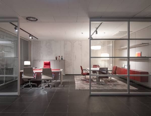
Our experts explained, “There is no direct lighting in the boardroom, and all lighting is white, with hues of blue and grey on the walls and interior. This sort of clinical environment encourages confrontation and intimidation by building tension and feelings of anxiety.”
How boardrooms can be set up for a positive experience
We know boardrooms can certainly be designed to purposely incite specific emotions. Still, it doesn’t always have to be in such a dramatic or “negative” manner.
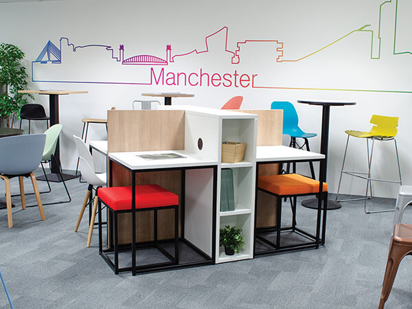
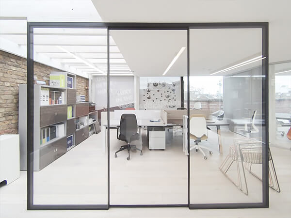
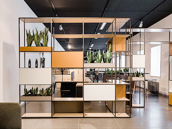
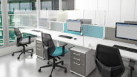
In recent years, there has been a huge shift in office design, introducing more playfulness, bold colours, a casual environment, communal areas, and co-working spaces. These changes have come into play in businesses looking to foster a more creative environment that encourages camaraderie, teamwork, and productivity in the workplace.
Since COVID-19 and the end of the lockdowns, we’ve witnessed the swift emergence of “Resimercial” designs in offices—a trend that blends elements of commercial and residential spaces to create a more homely-feeling workspace. As a result, this makes the workforce feel safe and encourages them to return to the office by providing a working environment that feels less clinical and more like home.
Discover the perfect office furniture at Auraa Design
Are you feeling inspired and looking to upgrade your office space into a more creative and productive setting? Enhance your workspace with our versatile selection of office furniture solutions. From ergonomic meeting room chairs that prioritise comfort to large meeting room tables designed to heighten productivity and spark creativity, we have all you need to create an inspiring environment. Explore our range of conference tables and collaborative seating options, which are ideal for improving those important brainstorming sessions and collaborative workflows. With our commitment to providing high-quality products and customer satisfaction, let us help transform your office space into a hub of creativity and efficiency – contact us to discover how we can revolutionise your workspace today.


